
Featured Social Media Software:
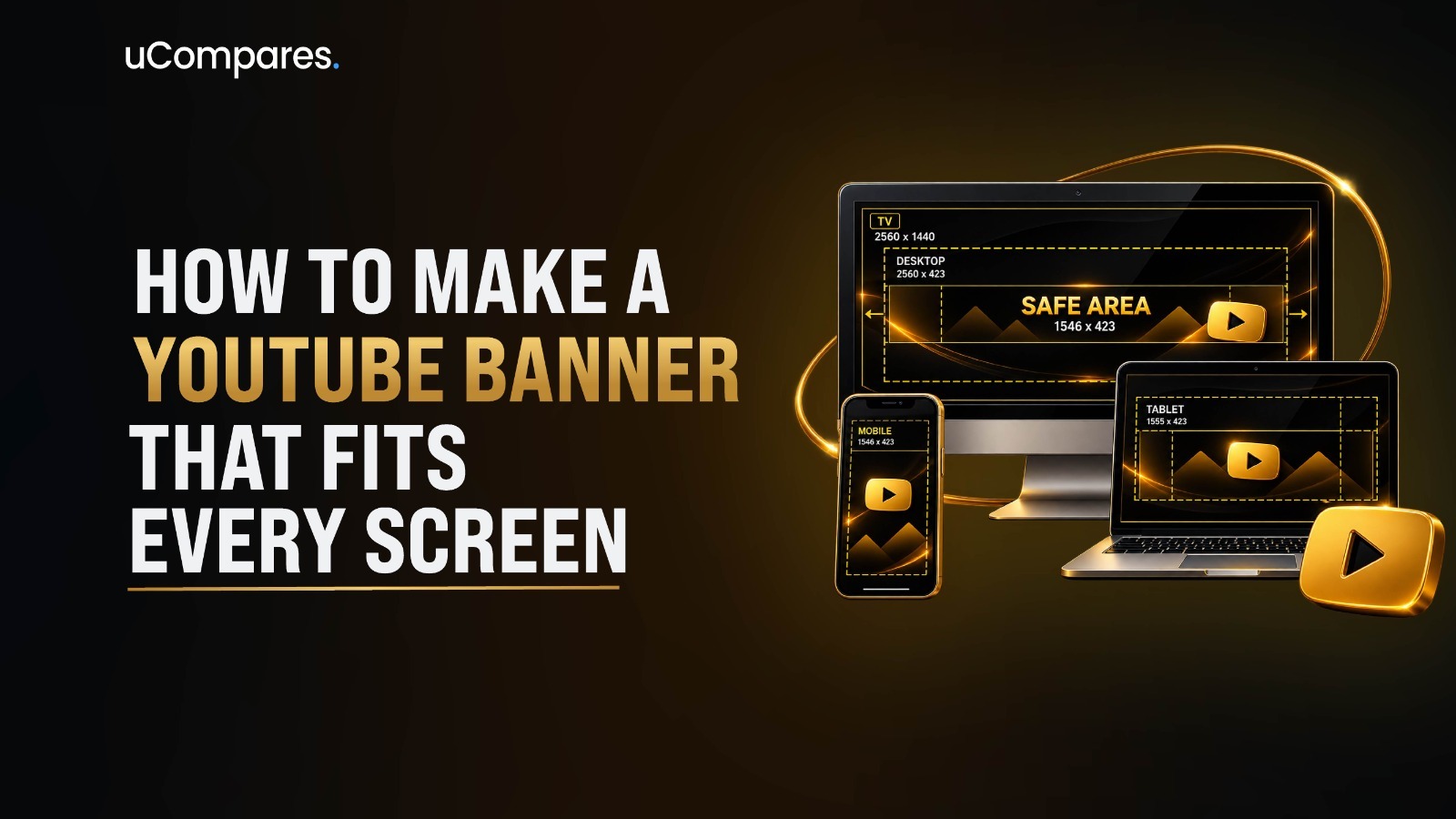
A YouTube banner is the wide image displayed at the top of your channel page. Upload it at 2560 x 1440 pixels, but keep every important element like your logo, channel name, and tagline inside the 1546 x 423 pixel safe area, since that’s the only region YouTube guarantees will be visible on every device. Anything outside it may be cropped on mobile or TV.
Your banner is the first thing a new visitor sees before they watch a single video, and it’s one of the few places on YouTube where you have full creative control over branding. Get the sizing wrong, and your logo gets clipped on phones or your text turns into a blurry mess on a smart TV. Get it right, and your channel looks intentional, professional, and trustworthy from the first second someone lands on it.
This guide walks through: what a YouTube banner actually is, the exact dimensions and safe area YouTube currently specifies, a full design process, how to build one in Canva and without it, how to upload it correctly, common mistakes to avoid, and examples by channel type. So you only need to read this thoroughly to get it done right.
What Is a YouTube Banner?
A YouTube banner is the horizontal image that spans the top of your channel page, sitting above your videos and below your profile picture. It’s separate from your profile picture and your video thumbnails, and it’s the main visual space YouTube gives you to communicate your brand at a glance.
The banner appears once per channel, at the top of your channel homepage, directly behind or above your channel name, subscriber count, and profile picture, depending on the device. It’s visible whether someone reaches your channel through search, a video, a link, or a subscription feed, which is why consistency matters here more than on almost any other channel asset.
YouTube Banner vs. Thumbnail vs. Profile Picture
These three elements often get confused, but they serve different jobs:
| Element | Purpose | Where It Appears | Typical Size |
| Banner | Brand identity for the whole channel | Top of channel page | 2560 x 1440 px |
| Profile picture | Your recognizable avatar/logo | Next to every video, comment, and search result | 800 x 800 px |
| Thumbnail | Encourages clicks on one specific video | Video grids, search, suggested videos | 1280 x 720 px |
In my own experience reviewing channels across niches, the biggest branding inconsistencies usually come from treating these three as separate design projects instead of one cohesive system; the banner, avatar, and thumbnails should share colors, fonts, and tone.
Why The YouTube Banner Matters?
A banner is often doing the job of a landing page. Viewers who land on your channel are usually deciding whether to subscribe, and your banner is doing a large share of that persuasion work in about two seconds of attention before they’ve watched a single video or read your channel description.
This matters more than most creators assume because a banner is frequently the first true “branding” moment a channel gets. A video thumbnail can pull someone in, but it’s the channel page and the banner sitting at the top of it that either confirms “yes, this is worth following” or quietly loses the click. It’s the same first-impression principle that applies to genuinely good YouTube video: viewers make fast, largely subconscious judgments, and a banner that looks unfinished or generic can undercut even strong video content sitting just below it.
At a glance, a strong banner should tell a new visitor:
- Who you are channel name or logo
- What your content is about niche or value proposition
- Why they should stay: tagline, upload schedule, or a credibility signal
- What to do next: a subtle call-to-action
Get these four right, and the banner does its job before the visitor even scrolls down to the video grid.
YouTube Banner Size and Dimensions
Your YouTube banner can look perfectly designed in the editor and still appear awkward once YouTube crops it for different screens. That’s why YouTube banner size is less about filling a large canvas and more about knowing which part of that canvas will actually remain visible.
Recommended YouTube Banner Size
For a YouTube channel banner, using the recommended ratio gives you a high-resolution canvas that can scale across large displays without making the original artwork unnecessarily small.
- 2560 x 1440 pixels
- 16:9 aspect ratio
- File size under YouTube’s current upload limit
This is the recommended canvas because it’s large enough to render sharply on the biggest displays your banner needs to support 4K and large-format smart TVs without YouTube having to upscale a smaller image.
Minimum YouTube Banner Size
If you’re working with a smaller canvas, YouTube’s minimum recommended dimensions still give you enough resolution for a usable YouTube channel banner.
- 2048 × 1152 pixels
- 16:9 aspect ratio
- File size under YouTube’s current upload limit
This is the minimum size to work with, but it isn’t the best starting point for a new design. A smaller canvas gives you less room to work and can look softer when displayed on larger screens. If you’re designing from scratch, 2560 × 1440 pixels is the safer choice.
YouTube Banner Size for Mobile, Desktop, and TV
| View | What Gets Shown | Design Implication |
| Full canvas | Entire 2560 x 1440 image | Background and decorative elements can fill this |
| Desktop | Wide horizontal slice | Most forgiving, shows more of the canvas width |
| Tablet | Medium-cropped slice | Between mobile and desktop |
| Mobile | Tightly cropped, centered slice | Only the safe area is reliably visible |
| TV | Large cropped slice, often full height | Shows more vertical space, less width |
Before publishing, always use YouTube Studio’s built-in preview; it shows you how the banner will render on each device type.
What Should You Put on a YouTube Banner?
A poorly designed banner is a bad first impression, so it deserves the same careful thought as any other branding decision. It should quickly establish what the channel is about while staying clear and consistent with your overall brand.
The right elements depend on your channel type, but most effective banners combine a few key components:
- Channel Name or Logo. If your channel name isn’t already legible in your profile picture, it should appear in the banner. Keep it large, high-contrast, and inside the safe area.
- Tagline or Value Proposition. One short line explaining what a viewer gets by staying. Not a slogan, but a plain statement like “Weekly React tutorials for beginners” or “Budget travelling for solo women.”
- Content Category or Niche. Especially useful for new channels: a quick visual cue, icon, color palette, or label that signals your niche instantly, before anyone reads a word.
- Upload Schedule. A simple line like “New videos every Tuesday” sets expectations and can improve return-visit behavior, since viewers know when to come back.
- Social Media Handles. Optional, and usually only worth including if you’re actively cross-promoting. Skip handles for platforms you rarely post to.
- Call to Action. A specific prompt performs better than a generic one. “Subscribe for weekly tutorials” outperforms a plain “Subscribe” because it repeats the value proposition.
What Not to Overcrowd the Banner With?
- Too many taglines or competing headlines
- Long paragraphs of text
- More than 2 to 3 fonts
- Every social platform you have an account on, active or not
- Fine print, disclaimers, or legal text (put that on your About page instead)
How to Design a YouTube Banner: Easy steps
The design process becomes much easier when you decide on the branding, content, and layout before adding visual elements, then turn that idea into a layout that works across different screen sizes.
Step 1: Define Your Channel’s Brand
Before opening any design tool, get clear on:
- Niche: what your channel is actually about
- Audience: who you’re designing for (their taste, age range, expectations)
- Tone: playful, professional, edgy, minimal, etc.
- Brand colors: 2-3 consistent colors, ideally matching your logo/thumbnails
- Typography: one primary font for headlines, one secondary for supporting text
Step 2: Choose Your Banner Layout
Common layout patterns that work well within the safe-area constraint:
- Center-focused: logo and text centered, symmetrical background
- Text + image: text on one side of the safe area, supporting image on the other (accepting that the image portion may crop on mobile)
- Minimalist: solid or gradient background, small centered logo/text, lots of negative space
- Creator-focused: a photo of the creator, usually best for personal/vlog-style channels
- Business/brand-focused: logo-led, product or service imagery, more corporate tone
Step 3: Add Your Most Important Information
Prioritize ruthlessly. With the layout decided, add the information that helps a new visitor understand the channel quickly. Keep the hierarchy clear so secondary details don’t compete with the main message.
- Channel name or logo: the primary identifier
- Value proposition: a short explanation of what viewers can expect
- Niche or content category: useful when the channel’s focus isn’t immediately obvious
- Upload schedule: optional, but helpful for channels with a consistent publishing routine
- Social handles or CTA: include only when they add meaningful value
Step 4: Choose Fonts and Colors
Your typography and color choices should make the banner easy to recognize and read rather than becoming the main attraction. Use the existing visual language of your channel wherever possible.
- Prioritize readability over decorative font styles.
- Maintain strong contrast between text and its background
- Limit the number of fonts and colors to keep the design cohesive
- Match the visual style of your thumbnails, logo, and profile picture
- Avoid placing light text over detailed or high-contrast photography without enough separation
Step 5: Add Images or Graphics
Visual elements can give your banner more personality, but they should support the channel’s message rather than compete with it.
- Background images: keep them relatively simple so they don’t compete with text
- Product photography: useful for business and e-commerce channels
- Illustrations or custom graphics: useful for creating a distinctive visual identity
- Creator photo: works particularly well for personal brands and creator-led channels
- Decorative elements: shapes, patterns, gradients, or subtle textures can add structure without overwhelming the layout
Step 6: Check the Design at Different Sizes
Before uploading the final file, review the banner as a viewer would see it rather than relying only on the full-size design.
- Preview it on mobile, desktop, and TV using YouTube Studio’s preview
- Check whether the text remains readable at smaller sizes
- Confirm that important elements aren’t being cropped
- Look for visual clutter that becomes more noticeable when the banner is reduced
- Make any final adjustments before publishing
How to Make a YouTube Banner on Different Platforms?
Canva isn’t the only option, and it isn’t the best fit for every skill level. Here’s a quick breakdown of three platforms and who each one actually suits.
Canva
Canva is the easiest entry point for most creators, especially anyone who doesn’t want to deal with a steep learning curve. Open Canva, sign in, and either search “YouTube banner” in the template library or start a blank design with the canvas manually set to 2560 x 1440 px.
- Use templates as a layout reference, not a finished product; an uncustomized template is easy to spot.
- Keep text and logos inside a 1546 x 423 px safe area, since Canva doesn’t always show this guide by default
- Export as PNG at full resolution to avoid compression artifacts on text and flat colors
Adobe Express
Adobe Express sits a step above Canva’s free tier in terms of polish, without requiring full Photoshop-level skills. It works well for creators who want cleaner typography and effects but still need a guided, template-based workflow.
- Choose a YouTube banner template sized correctly from the start, since Adobe Express templates are generally pre-set to YouTube’s dimensions.
- Use its font pairing and text effect tools to add a bit more visual depth than a basic Canva design.
- Keep the design simple regardless of the extra polish available, since the same overcrowding mistakes apply here too.
Photoshop
Photoshop is built for experienced designers who want pixel-level precision, custom effects, and a reusable layered source file. It’s overkill for a first-time banner, but it’s the strongest option for anyone maintaining consistent, evolving channel branding over time.
- Set up the canvas at 2560 x 1440 px with guides marking the 1546 x 423 px safe area
- Keep text, logo, and background on separate layers so future updates don’t require rebuilding the design from scratch
- Export as PNG to preserve sharp edges on text and logos
Whichever platform you use, the banner should stay consistent with the rest of your channel’s visual identity, the same way strong video production choices build a cohesive first impression once someone actually clicks through.
Steps to Upload a YouTube Banner
The design work matters, but plenty of good banners get uploaded incorrectly. Here’s the current process:
- Sign in to your YouTube account.
- Open YouTube Studio.
- Go to Customization (sometimes labeled under channel/profile settings).
- Open the Branding tab.
- Click Upload under the banner image section and select your file.
- Use YouTube’s built-in preview to check how it displays across devices.
- Adjust and re-upload if anything looks cropped or misaligned.
- Click Publish to save your changes.
For the exact current menu labels and any recent interface changes, YouTube’s own Help Center is the most reliable reference, since Studio’s navigation does get updated periodically.
YouTube Banner File Requirements
JPG vs. PNG
PNG generally preserves sharper edges on text, logos, and flat-color graphics, since it doesn’t use lossy compression. JPG produces smaller file sizes and works fine for photo-heavy banners where a small amount of compression is less noticeable. If your banner is mostly text and logo on a simple background, PNG is usually the safer choice.
Image Quality, Compression, and Why Blurry Banners Happen
Blurry banners almost always trace back to one of three causes: designing at a resolution smaller than 2048 x 1152 and then upscaling it, exporting at a lower quality setting than the platform needs, or letting a design tool auto-resize the file during download. Always design at the full recommended canvas size and export at maximum quality.
YouTube Banner Examples and Ideas
Rather than generic inspiration, here’s what should actually appear on a banner for each channel type, and why.
1. Gaming Channel Banner
Bold typography, high-energy color palette, and often a stylized character or game-inspired graphic. Upload schedule and stream days are especially useful here, since gaming audiences frequently check for live schedules.
2. Personal Creator Banner
A photo of the creator (builds instant recognition and trust), a short personal tagline, and a clear content focus, since personal channels often cover a mix of topics.
3. Business Channel Banner
Logo-led, using official brand colors, with a value proposition rather than a personality-driven tagline; the goal is corporate consistency across every platform.
4. Podcast Banner
Podcast cover art or logo, host names if relevant, and release schedule like: “New episodes every Thursday”, since podcast audiences are often habit-driven listeners.
5. Educational Channel Banner
Clear subject-matter signaling (subject icon, course topic, or credential line), since educational viewers are deciding whether the content matches their skill level before subscribing.
Final Checks Before You Upload Your YouTube Banner
Getting the design right is only half the job, much like the broader process of putting together a good YouTube video; a banner that looks great in the editor can still fall apart once it’s live, especially across the different screen sizes YouTube renders it on. Before uploading, it’s worth running through a quick checklist rather than eyeballing the design once and calling it done. This is also the stage where small mistakes tend to surface: text creeping too close to the edges, a logo that’s crisp on desktop but blurry on mobile, or branding that doesn’t quite match the rest of the channel.
Run through this checklist before publishing:
- Canvas is 2560 x 1440 px
- Aspect ratio is correct (16:9)
- All critical text sits inside the safe area
- Logo is clearly visible
- Channel name is legible at small sizes
- No important information sits near the edges
- Looks correct in the mobile preview
- Looks correct in the desktop preview
- Looks correct in the TV preview
- Image isn’t blurry or pixelated
- Branding matches your thumbnails and profile picture
Final Thoughts
A YouTube banner is a small piece of real estate that does an outsized amount of branding work. Getting it right comes down to a short list of fundamentals: use the correct 2560 x 1440 canvas, keep everything essential inside the 1546 x 423 px safe area, design with clear, high-contrast branding, and test the result across mobile, desktop, and TV before publishing. Skip any one of these steps, and the banner will look fine on your monitor and broken somewhere else.
Treat your banner the way you’d treat a storefront sign: sized correctly, legible from a distance, and consistent with everything else your channel puts out. Once it’s set up properly, it’s largely a “set it and revisit occasionally” asset rather than something you need to rebuild often.
Frequently Asked Questions(FAQs)
What is the YouTube banner safe area?
At the recommended 2560x1440px upload size, the safe area is 1546x423px, centered. This scales from YouTube’s base spec of 1235x338px at the 2048x1152px minimum upload size. The ratio is the same, just measured against a different canvas.
What file formats does YouTube accept for banners?
YouTube supports JPG, PNG, BMP, and non-animated GIF. Animated GIFs are not supported for channel banners.
What is the maximum file size for a YouTube banner?
6MB, regardless of format.
JPG or PNG, which is better for a YouTube banner?
PNG uses lossless compression and keeps text and logos sharp, so it’s the better choice for graphic-heavy banners. JPG works fine for photo-heavy designs where a smaller file size matters more than perfect detail.
Why does my banner look different on mobile than on desktop?
Desktop shows a wide horizontal strip across the full canvas width. Mobile shows only the centered safe zone. TV is the only device that displays the entire 2560x1440px image. Over 70% of YouTube traffic comes from mobile, so most viewers only ever see the safe zone version of your banner.
How often should I update my YouTube banner?
There’s no fixed rule, but refreshing it every few months keeps a channel looking active, especially around a rebrand, a new series, or a milestone. Avoid baking in specific dates that will need constant updating.
Can I add clickable links to a YouTube banner?
Yes, but it’s a separate feature from the image itself. Links are added through YouTube Studio’s channel links section, not designed into the graphic.
Does the banner affect YouTube SEO or ranking?
Not directly. YouTube’s algorithm doesn’t read banner images as a ranking signal. The effect is indirect, through subscribe rate and viewer trust once someone lands on the channel page.
Do I need a different banner for a rebrand, or can I just tweak the existing one?
It depends on the scope of the rebrand. A small update, a new tagline, or an upload schedule change can usually be layered onto the existing design. A full rebrand, new logo, new color palette, or a shift in content focus, is worth rebuilding from scratch rather than patching an old file, since mismatched old and new branding elements tend to look inconsistent rather than intentional.
Can I use the same banner across multiple channels or platforms?
Not directly. YouTube banners are sized specifically for the 2560x1440px canvas and its safe-area constraints, which don’t match the dimensions used by Twitch, Facebook, or other platforms. The same core branding, logo, colors, and tagline can carry across platforms, but the banner itself needs to be resized and re-checked against each platform’s safe zone before uploading.
What happens if my banner doesn’t meet the size or file requirements?
YouTube Studio will typically flag the file and block the upload if it’s outside the accepted formats or exceeds the 6MB limit. If the dimensions are technically valid but too small, YouTube will still accept and stretch the image, which usually results in a blurry or pixelated banner once it’s live, so it’s worth confirming the exact canvas size before exporting rather than relying on YouTube to catch it.