
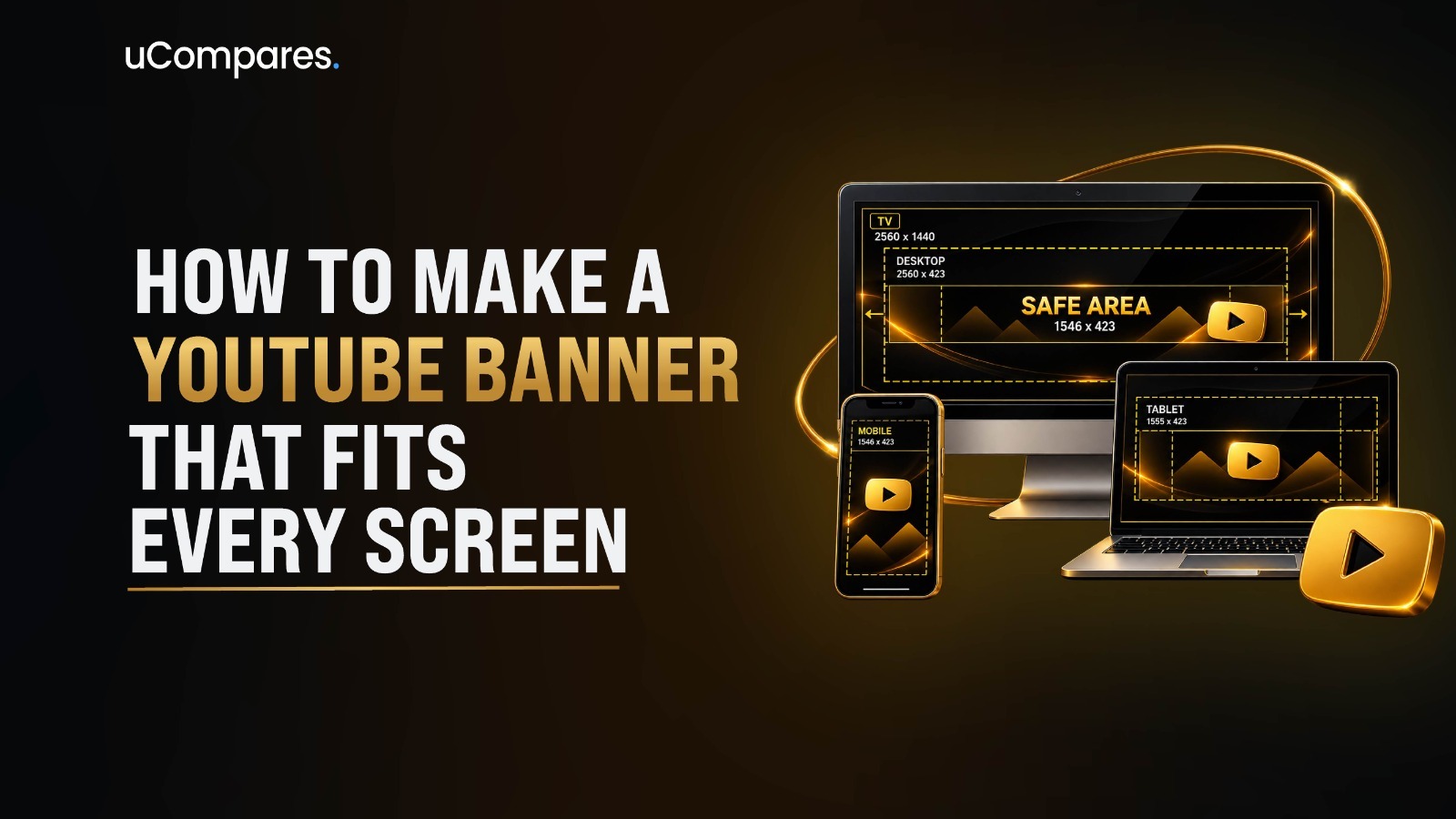
To make a YouTube banner that fits different screens, create the artwork on a 2560 × 1440 pixel, 16:9 canvas and keep all essential text, logos, faces, and other important elements inside the centered safe area. YouTube lists 2048 × 1152 pixels as the minimum upload size and recommends 2560 × 1440 pixels, especially for larger displays such as TVs. The official maximum file size is 6 MB.
The key is not to design separate banners for every device. Instead, create one high-resolution master banner, protect the central content area, use the outer portions primarily for background imagery, and preview the result before publishing.
This guide shows how to build the banner correctly from the beginning, where to place important content, how to design around the safe area, how to upload it through YouTube Studio, how to check the final result, and what to do if your banner still looks wrong.
What Is a YouTube Banner?
A YouTube banner, also called a banner image or channel art, is the large visual displayed across the top area of a YouTube channel.
It serves a different purpose from a YouTube thumbnail. A thumbnail is designed to attract attention to an individual video, while the banner represents the channel as a whole.
A banner can communicate:
- The channel name or brand
- The main subject of the channel
- A short value proposition
- A publishing schedule
- A recognizable visual style
- A campaign or seasonal message
- Supporting imagery or graphics
YouTube describes the banner as a larger space where creators can show what their channel is about. YouTube also recommends aligning the banner and profile picture so the channel presents a consistent identity.
What Size Should a YouTube Banner Be in 2026?
The recommended YouTube banner size is:
2560 × 1440 pixels
The image uses a 16:9 aspect ratio. YouTube specifically recommends this size, particularly for TV displays.
The important specifications are:
| Specification | Recommended / Official Value |
|---|---|
| Recommended dimensions | 2560 × 1440 px |
| Minimum upload dimensions | 2048 × 1152 px |
| Aspect ratio | 16:9 |
| Maximum file size | 6 MB |
| Safe area at minimum size | 1235 × 338 px |
| Recommended working canvas | 2560 × 1440 px |
YouTube’s official documentation states that the minimum upload size is 2048 × 1152 pixels and that the safe area for text and logos at that minimum size is 1235 × 338 pixels.
What Is the YouTube Banner Safe Area?
The safe area is the central part of the banner where you should place information that must remain visible.
YouTube officially gives the safe-area measurement as 1235 × 338 pixels at the minimum 2048 × 1152 canvas.
If you design at YouTube’s recommended 2560 × 1440 size, the equivalent proportional safe area is approximately 1546 × 423 pixels.
That distinction is important because you may encounter both numbers online:
- 1235 × 338 px — YouTube’s official safe-area measurement at the minimum 2048 × 1152 upload size.
- Approximately 1546 × 423 px — the proportional equivalent when designing at the recommended 2560 × 1440 canvas.
Therefore, for a 2560 × 1440 design, think of the center 1546 × 423 pixel region as the practical protected zone for critical content.
Why Does a YouTube Banner Get Cropped?
YouTube Uses Different Display Areas
The most common reason a banner looks different on different devices is cropping. YouTube explains that banners need to accommodate the entire screen for larger devices but can be cropped on certain views and devices.
This means the complete 2560 × 1440 canvas is not necessarily visible in the same way everywhere.
For example, a wide television display may reveal much more of your background, while a narrower device can show a smaller portion of the original image.
That is why placing a headline near an outer edge is risky.
Cropping Is Not the Same as Resizing
Resizing means changing the displayed dimensions of the image while retaining the same general composition. Cropping means removing part of the image.
A banner can be high-resolution and still appear incorrectly if its important elements are positioned outside the visible region.
This is why simply uploading a large image does not guarantee a good result.
Resolution solves image quality; safe-area design solves visibility. You need both.
What Should You Do Before Designing a YouTube Banner?
Choose the Main Purpose
Before opening Canva, Photoshop, Adobe Express, or another design tool, decide what the banner needs to communicate. A strong banner normally has one primary message rather than several competing messages.
For example, a hypothetical technology channel might use:
“Simple AI Tutorials for Everyday Work”
A gaming channel might use:
“Weekly Strategy Guides, Builds & Game Reviews”
A business channel might use:
“Practical Marketing Strategies for Growing Brands”
These examples are illustrative rather than claims about actual channels. The goal is to understand the principle: the viewer should quickly understand what the channel is about.
Decide Which Elements Are Essential
Create a short content list before designing.
For example:
- Logo
- Channel name
- Main promise
- Upload schedule
- One supporting graphic
Then classify each item as either essential or decorative. Essential elements should remain inside the safe area. Decorative elements can extend beyond it.
Prepare High-Quality Source Assets
Use high-resolution source images whenever possible.
A low-resolution photograph stretched across a 2560 × 1440 canvas can still look soft even if the final file technically meets YouTube’s dimensions.
Prepare:
- High-resolution photos
- Transparent logo files
- Brand fonts
- Brand colors
- Icons
- Background image
If your logo has a transparent background, a PNG or another format that preserves transparency can make positioning easier during design.
How to Make a YouTube Banner That Fits Every Screen
Step 1 — Create a 2560 × 1440 Canvas
Open your preferred design application and create a new image at:
Width: 2560 pixels
Height: 1440 pixels
Aspect ratio: 16:9
This gives you the recommended YouTube banner canvas. YouTube specifically recommends 2560 × 1440 pixels, especially for TV displays.
Do not start with a narrow mobile banner and stretch it to YouTube’s recommended size. Build the master artwork at the full recommended dimensions.
Step 2 — Mark the Center Safe Area
Create a temporary centered rectangle representing approximately:
1546 × 423 pixels
on your 2560 × 1440 canvas.
This is the proportional safe area corresponding to YouTube’s official 1235 × 338 safe area at the minimum 2048 × 1152 dimensions.
Keep the rectangle visible while designing. You can later remove the guide before exporting.
The purpose of this guide is not to make the entire banner visually boring. It simply tells you where the information that must survive cropping should remain.
Step 3 — Build the Background First
Start with the background rather than the text.
You could use:
- A solid brand color
- A gradient
- A photograph
- A textured background
- An abstract illustration
- A combination of photography and color
Extend the background across the complete 2560 × 1440 canvas.
This is where you can safely use the outer portions of the image because the background does not necessarily need to remain visible in every crop.
Step 4 — Add the Main Visual
Place your main photograph, illustration, or graphic.
If the design contains a person, product, mascot, or other important subject, keep the most important part of that subject close enough to the center that cropping does not destroy the visual message.
For example, if a person’s face is the central branding element, avoid placing the face near an extreme edge.
If the image extends outside the safe area, make sure the cropped version still looks intentional.
Step 5 — Add Your Channel Name
Add the channel name inside the safe area. The channel name should be visually distinct from secondary information.
Avoid using extremely small text merely because the banner has a large canvas.
Remember that the banner can appear on relatively small screens. Text that looks comfortable while zoomed in during editing may become difficult to read in the actual channel interface.
Step 6 — Add One Clear Message
Add a short phrase explaining what viewers can expect. Good banner copy is usually concise.
For example:
“Weekly Photography Tutorials”
or:
“Learn Web Design From Scratch”
The exact wording should reflect the channel rather than imitate another creator.
Avoid filling the banner with paragraphs, multiple slogans, contact information, hashtags, and every topic your channel covers.
A banner has limited attention available. Use that space for the information that helps a visitor understand the channel quickly.
Step 7 — Add the Logo Carefully
Place the logo inside the safe area if it is an essential part of your branding. Keep sufficient space around it.
A logo that touches other elements can become difficult to recognize after the banner is displayed at a smaller size.
The profile picture is already another major branding element on YouTube, so the banner does not need to repeat the exact same visual in an oversized format.
Step 8 — Match the Banner With Your Channel Branding
Your banner should visually relate to:
- Profile picture
- Video thumbnails
- Channel colors
- Typography
- Website branding
- Other social profiles
YouTube recommends aligning the banner and profile picture and keeping channel branding consistent with the broader brand identity.
This does not mean every element needs to look identical.
Instead, use consistent visual signals such as the same primary color family, typography style, logo treatment, or photographic approach.
Step 9 — Keep the Outer Areas Flexible
Once your essential elements are positioned, examine everything outside the safe area.
Ask:
If the left and right sides disappeared, would the banner still make sense?
If the answer is yes, the design is much more resilient.
The outer area should support the central message rather than contain information required to understand it.
Step 10 — Check Text Contrast
Text must remain readable against its background.
If the background is busy, consider:
- Darkening the background
- Lightening the background
- Adding a subtle overlay
- Simplifying the area behind the text
- Increasing text weight
- Reducing decorative detail
Do not solve every contrast problem by adding heavy shadows or outlines. YouTube’s banner guidelines specifically advise against additional file embellishments such as shadows, borders, or frames as part of the banner image.
The cleaner solution is often to improve the background behind the text.
Step 11 — Remove the Safe-Area Guide
Before exporting, hide or delete the temporary safe-area rectangle. Do not accidentally export the guide as part of the final banner.
This is a simple step, but it is worth checking because design guides can easily remain visible in exported files.
Step 12 — Export the Banner
Export the final banner while maintaining:
2560 × 1440 pixels
and keep the final file at or below:
6 MB
YouTube’s current branding documentation lists 6 MB as the maximum file size for the banner.
For a design containing sharp typography and graphics, a high-quality PNG can work well if the file remains under the limit. For photographic banners, a high-quality JPEG can provide a smaller file size. The correct choice depends on the content of the image.
How to Upload a YouTube Banner
Upload Through YouTube Studio on Desktop
YouTube currently places channel branding controls inside YouTube Studio.
The general desktop workflow is:
- Sign in to YouTube.
- Open YouTube Studio.
- Select Customization from the left-hand menu.
- Open the Profile area.
- Select the option for the banner image.
- Upload your completed banner.
- Review the preview.
- Save the changes.
YouTube’s current channel customization documentation identifies Customization as the area used to manage channel branding, including the profile picture, banner image, video watermark, channel name, handle, description, and links.
YouTube’s interface can change over time, so button labels may move slightly even when the underlying workflow remains similar.
Upload From a Phone
YouTube also provides mobile workflows for changing the channel banner.
On Android, YouTube’s official instructions include opening the profile area, viewing the channel, selecting EDIT Image, choosing the banner image, and saving it.
On iPhone and iPad, YouTube’s instructions similarly allow creators to open the channel, select EDIT Image, choose the banner image, and save it.
For a detailed design workflow, however, a desktop design application is generally easier because it provides more control over exact dimensions, guides, typography, layers, and positioning.
How to Verify That Your YouTube Banner Fits Every Screen
Check the Original File
Before looking at YouTube, verify these basics:
| Check | Target |
|---|---|
| Canvas width | 2560 px |
| Canvas height | 1440 px |
| Aspect ratio | 16:9 |
| Critical content | Inside central safe area |
| Maximum file size | 6 MB |
| Temporary guides | Removed |
| Text readability | Clear at reduced size |
These checks catch many problems before the image is uploaded.
Preview the Banner on Different Devices
Do not evaluate the banner only from your design application.
Check it on:
- Desktop browser
- Smartphone
- Tablet if available
- Television or TV-sized preview when possible
YouTube’s official guidance specifically emphasizes designing for different displays because the banner can be cropped on different views and devices.
The most important test is whether the essential message remains understandable.
Perform the Squint Test
Reduce the banner preview substantially. If the main message disappears into tiny details, the design is probably too complicated.
At a reduced size, you should still be able to identify:
- The channel identity
- The main subject
- The primary visual
- The overall brand style
This is a practical design test rather than an official YouTube requirement.
Perform the Crop Test
Temporarily hide the left and right outer portions of the banner. Then hide the top and bottom areas. If the central content remains coherent, your layout has good crop tolerance.
If important words suddenly disappear, move them toward the center.
What to Do If Your YouTube Banner Does Not Fit
Problem: The Banner Looks Cropped
Most likely cause: Important elements were placed outside the protected center area.
Solution: Move important content toward the center and re-export.
How to verify: Preview the revised banner on both a desktop and mobile device.
Problem: Text Is Cut Off
Most likely cause: The text is too close to the outer edges.
Solution: Move the complete text block into the central safe area rather than simply reducing the font size.
Verification: Confirm that the entire headline remains visible and readable after the banner is displayed at a smaller size.
Problem: The Banner Looks Blurry
Most likely cause: The source artwork or exported image has insufficient resolution, or a small image has been enlarged excessively.
Solution: Rebuild or export the banner at 2560 × 1440 pixels using higher-resolution source assets.
Verification: Inspect fine text and edges at normal viewing size rather than only zooming into the original design file.
Problem: YouTube Rejects the File
Most likely cause: The file does not meet YouTube’s upload requirements, such as dimensions or file size.
Solution: Confirm that the image is at least 2048 × 1152 pixels, uses the required 16:9 proportion, and is no larger than 6 MB.
Verification: Re-export the image and check the final file properties before uploading again.
Problem: The Banner Looks Good on Desktop but Bad on Mobile
Most likely cause: The design was optimized for the full-width desktop appearance rather than the central content area.
Solution: Reposition essential content into the center safe area and use the outer areas only for flexible background design.
Verification: Open the channel on a smartphone and check whether the channel name, logo, and main message remain visible.
Problem: The Banner Feels Too Crowded
Most likely cause: Too much information was treated as essential.
Solution: Remove secondary information and retain one main message, supporting branding, and enough visual breathing room.
Verification: Ask whether someone unfamiliar with the channel can understand its subject within a few seconds.
Common YouTube Banner Design Mistakes
Designing Only for Desktop
A desktop preview can make a banner appear spacious because you can see a large portion of the artwork.
The problem is that YouTube can crop the banner differently across devices. Designing exclusively around a desktop composition increases the risk that important information will disappear elsewhere.
Correct approach: Design the complete canvas but protect the central content.
Using the Wrong Canvas Size
Starting with an unrelated social-media banner size can create unnecessary cropping and resizing problems.
Correct approach: Start with 2560 × 1440 pixels when possible.
Putting the Logo Near an Edge
A logo close to the edge may look balanced in the editor but can disappear when the banner is cropped.
Correct approach: Keep essential branding inside the protected central area.
Adding Too Much Text
The banner is not the place for a complete channel description.
Correct approach: Use one clear message and let your channel description, videos, playlists, and other channel elements provide the remaining information.
Using Low-Resolution Images
A 500-pixel photograph cannot become genuinely detailed simply because it is placed on a 2560-pixel canvas.
Correct approach: Start with appropriately large source images and export the final banner at the recommended dimensions.
Ignoring the File-Size Limit
A technically correct 2560 × 1440 banner can still be too large as a file. YouTube’s official limit is 6 MB.
Correct approach: Compress or re-export the image while preserving sufficient visual quality.
Forgetting to Remove Design Guides
Safe-area guides are useful while designing but should not appear in the final image.
Correct approach: Hide all guides before export.
Alternative Ways to Create a YouTube Banner
Method 1 — Use a Template-Based Design Tool
Template-based tools can simplify the process for beginners because the canvas, typography, and visual elements can be arranged without building everything from scratch.
The important requirement is still the same: verify that the final canvas follows YouTube’s current specifications and that essential content remains within the safe area.
YouTube itself notes that Canva is one option creators can use to create banner images.
Method 2 — Use Adobe Express
Adobe Express provides a browser-based approach for creating social graphics and YouTube banners.
The advantage is speed: creators can begin with a template and customize colors, images, typography, and messaging.
Regardless of the tool, always verify the final exported dimensions against YouTube’s official requirements rather than assuming a template is permanently current.
Method 3 — Use Professional Design Software
Advanced users can build the banner in software such as Photoshop or another professional graphics editor.
This method provides greater control over:
- Layers
- Masks
- Typography
- Color
- Image adjustments
- Guides
- Smart objects
It is particularly useful for businesses and established brands that need a repeatable design system.
How to Choose the Right YouTube Banner Design
Use This Decision Framework
| Your Situation | Practical Approach |
|---|---|
| First YouTube channel | Start with a simple template |
| Personal creator brand | Use a clear portrait or visual identity |
| Gaming channel | Use one strong game-related visual and concise branding |
| Educational channel | Prioritize topic clarity and readable typography |
| Business channel | Match the company’s existing visual identity |
| Podcast channel | Emphasize the show identity and recognizable artwork |
| Established channel | Build a reusable brand system |
| Seasonal campaign | Change the visual message while preserving brand recognition |
The important point is not to choose a particular design style because it is universally “best.” The correct design depends on the channel’s purpose, audience, content, and existing visual identity.
Advanced Tips for a More Effective YouTube Banner
Design Mobile-Aware, Not Mobile-Only
A common mistake is to design only for the smallest screen.
Instead, use the full 2560 × 1440 canvas and make the center robust enough to survive smaller crops.
This produces a banner that can expand visually on larger displays without sacrificing the core message.
Create Visual Hierarchy
Not every element should have the same visual weight.
A practical hierarchy is:
Channel identity → Main message → Supporting visual → Decorative details
If everything is large, bold, bright, and prominent, nothing appears important. Use size, contrast, spacing, and position to communicate hierarchy.
Match Banner and Thumbnail Design
The banner does not need to copy your thumbnails, but they should feel related.
For example, you might reuse:
- Brand colors
- Font family
- Image treatment
- Accent shapes
- Logo style
- Photography style
This makes the channel easier to recognize when viewers move between the channel page and individual videos.
Leave Breathing Room
Empty space is not wasted space.
A clean area around your main headline can improve readability and make the banner feel more deliberate.
Crowding every available pixel can make the channel look less organized, especially when the image is displayed at a smaller size.
Use Your Upload Schedule Carefully
YouTube specifically suggests that creators with a regular upload schedule can include that schedule in the banner so viewers know when to return.
However, only include a schedule if you can maintain it.
A schedule that becomes outdated can make the channel appear neglected.
If your publishing frequency changes often, a more evergreen statement may be more appropriate.
Keep the Banner Easy to Update
For a recurring content brand, maintain an editable master file.
Separate:
- Background
- Logo
- Main headline
- Supporting text
- Decorative elements
This makes future updates much easier.
You can change a seasonal message or upload schedule without rebuilding the entire banner.
Expert Insights for YouTube Banner Design
Treat the Safe Area as a Content Budget
The safe area is more than a technical restriction. It can be treated as a limited content budget.
Instead of asking:
“What can I fit into this banner?”
ask:
“What information deserves the limited guaranteed space?”
This naturally encourages better prioritization.
The logo, channel identity, and primary promise usually deserve more attention than secondary information.
Separate Information From Decoration
A reliable design system distinguishes between information that viewers must read and visual material that simply supports the brand.
For example:
Information:
- Channel name
- Main topic
- Short promise
Decoration:
- Gradient
- Texture
- Abstract shapes
- Background photography
If YouTube crops the decorative elements, the banner can still communicate its purpose.
Design for the Least Forgiving View
A useful practical workflow is to design the complete canvas first and then test the most restrictive crop.
If the central composition works in the narrow view, you can use the wider canvas to add visual richness without making the essential message dependent on those outer areas.
This approach reduces the number of redesigns caused by unexpected cropping.
Use Consistency Instead of Complexity
A professional banner does not need dozens of elements. A strong identity can come from just a few consistent signals:
- One color system
- One typography approach
- One logo treatment
- One photography style
- One clear message
This is especially useful for small creators who want a professional appearance without creating a complicated brand system.
Frequently Asked Questions
What is the correct YouTube banner size in 2026?
The recommended YouTube banner size is 2560 × 1440 pixels with a 16:9 aspect ratio. YouTube lists 2048 × 1152 pixels as the minimum upload size.
What is the YouTube banner safe area?
YouTube officially specifies a 1235 × 338 pixel safe area at the minimum 2048 × 1152 canvas for text and logos. When designing at the recommended 2560 × 1440 canvas, this corresponds proportionally to approximately 1546 × 423 pixels in the center.
Why does my YouTube banner look different on mobile?
YouTube adapts and crops banner artwork for different displays. Important information placed outside the central safe area may therefore disappear on smaller views.
Can I use 1920 × 1080 for a YouTube banner?
1920 × 1080 is also a 16:9 image, but it is below YouTube’s current stated minimum upload dimensions of 2048 × 1152. For a new banner, use the recommended 2560 × 1440 canvas instead.
What is the maximum YouTube banner file size?
YouTube’s current channel branding documentation lists 6 MB or smaller for the banner image.
Should the YouTube banner be PNG or JPEG?
Either can be appropriate depending on the design. PNG can work well for graphics and sharp typography, while JPEG can be useful for photographic banners because it can produce a smaller file. In either case, the final image must meet YouTube’s current upload requirements and remain within the 6 MB limit.
How do I make sure my YouTube banner is readable on mobile?
Keep the channel name, logo, primary headline, and other essential information within the central safe area. Then preview the uploaded banner on an actual mobile device before considering the design finished.
How often should I change my YouTube banner?
There is no universal replacement schedule. YouTube suggests that creators can update banner visuals when their values, message, branding, or content direction changes. Creators with regular upload schedules can also use the banner to communicate that schedule.
Can I create a YouTube banner on my phone?
Yes. YouTube provides mobile options for changing the channel banner on both Android and iOS.
Read More:
Final Takeaway
A YouTube banner that fits every screen is not created by making several different banners. It is created by designing one correctly sized master image and understanding how YouTube displays and crops that image across different devices.
Start with 2560 × 1440 pixels, use the 16:9 canvas, protect the central safe area, keep essential information concise, extend flexible background elements toward the edges, and verify the finished design on mobile, desktop, and larger displays. These steps give you a banner that is technically compliant while also remaining readable and visually consistent across the devices where viewers may encounter your channel.